There’s been a frenzy of discussion on Twitter this summer about conference poster design (see #betterposter, #betterposters, #butterposter) so perhaps it’s a good time to re-share my Powerpoint templates. You just download, then replace the existing text with your own. All assume that you have a catchy graphic — that goes where the yellow box is. The text you replace contains basic tips but ignore the advice if you’re a pro. If you’re new to posters please see my page, “Designing conference posters” for details.
About that graphic: I strongly believe that it should be large and self-explanatory so that a viewer could follow your approach, results, and conclusions without you needing to explain a thing. If you have a graphic that is too complex (or poorly designed), a poster might not be the right venue for you.
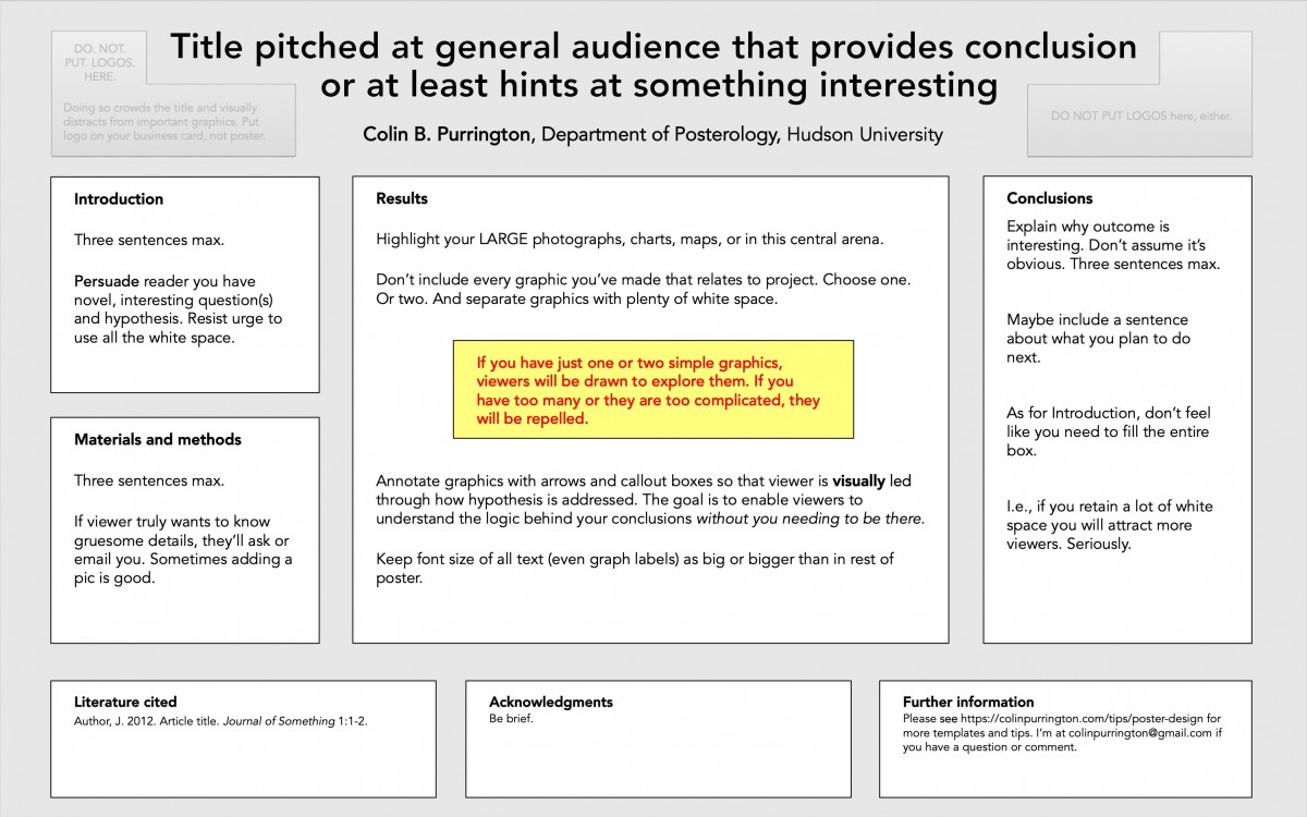
Below is a standard horizontal template. Note that there is no requirement for the text boxes to have a line around them — it’s easy to set line width to zero. And if you want to delete the background color (gray, here), you can eliminate the “rectangles within rectangles” look. Totally up to you.
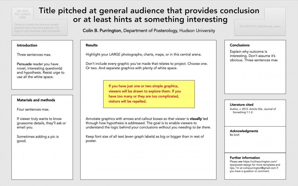
Here’s a template that moves the Literature cited, Acknowledgements, and Further information to the far right column … which causes the Materials & methods and Results areas to have more room. But the Conclusions box gets squished (such is geometry).
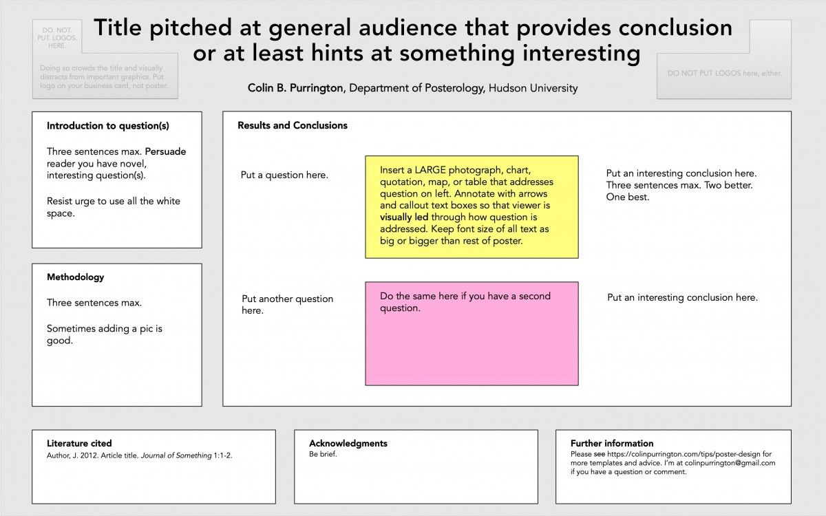
Here’s a template that might work for a humanities topic. I’ve chosen to have a question/result/conclusion flow (from left to right) inside the main arena, but you can always rearrange. There are also no rules about section names — just redo those, too.
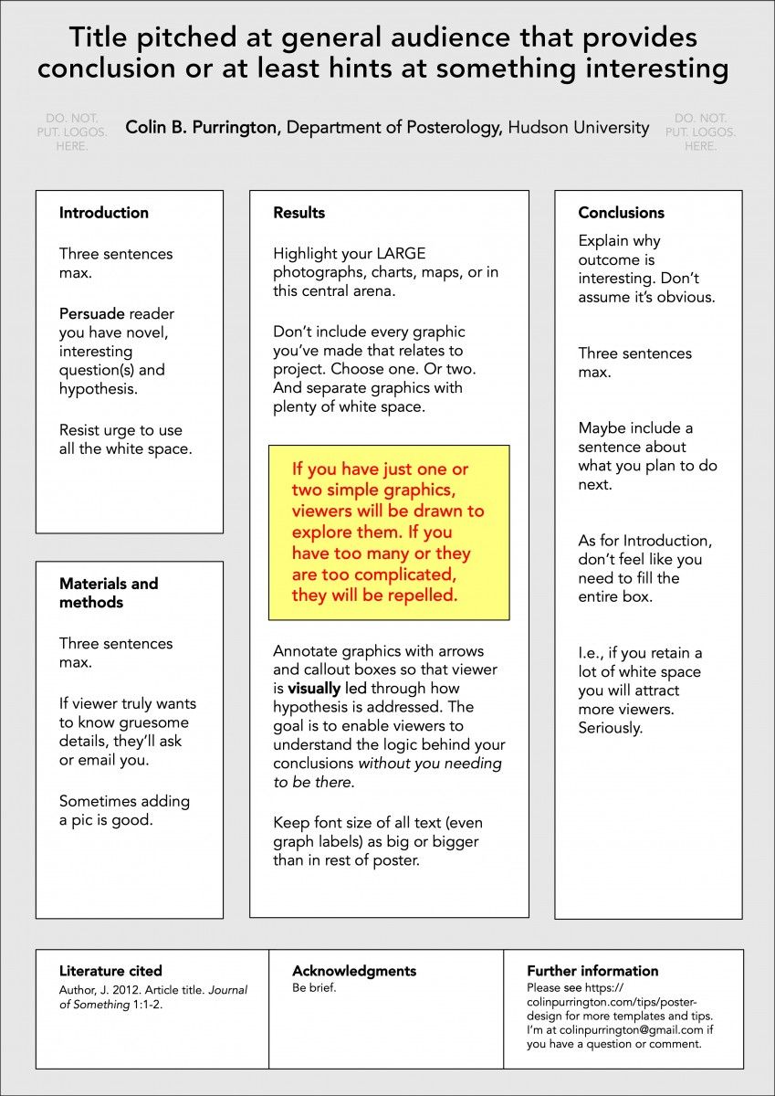
The final template is a portrait-style one. For this orientation I think it’s critical to put the least important sections on the very bottom (that position is really hard to read without stooping).
If you’d like to read an article about the frenzy, here’s one from Inside Higher Education in which I’m quoted a few times.
The astute reader will notice that I don’t push the use of QR codes. I did for a decade but people who used my templates and included a QR code (inside the Further information box) said that it was never used and was a waste of space. One said that he felt like a dork and blamed me. But if you feel like you can weather the scorn, by all means pop one in there. But make it small because it really isn’t an interesting graphic. Another issue with displaying a QR code is that it invites a viewer to take photographs of your entire poster. E.g., if you are not around to police it, many people are going to take photographs of your entire poster if they take a photo of the QR code. If that’s OK with you, fine, but many people might be alarmed by that. If you are enamored with QR codes but don’t want to soil your poster, just print business cards that have a QR code (and your name and email address, perhaps) — then leave them all in an envelope pinned next to your poster (“Please take one!”). Something like this, perhaps:

Happy posterizing!
The post Templates for better posters appeared first on Colin Purrington.


